Importance Of Responsive Web Design
You have probably heard the buzz right now one way or another. Responsive web design has been a very hot topic in 2014 and for good reason.
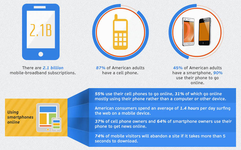
When you look around at the incredible amount of devices on the market these days it’s not surprising that current market research shows mobile internet usage is set to grow massively by 2015 with an increase of almost 20% from 2010. What is more interesting is that this also means that the number of mobile internet users will overtake that of desktop users during this time.
There is little doubt that this change in how people are browsing the Internet and viewing websites means we need to be considering how we engage with them to offer the best online experience for our products and services. So what can you do to make this happen? Simply ensure that your website is built with Responsive technology.
Responsive Web Design is a coding technique that allows a website to adapt to the size of screen it is being viewed on. Someone opening your site on a small smartphone will be shown the same site as the person opening it on their laptop but the site will have noticed the constraints and automatically reformat to give the user an experience better suited to their device and it’s display area. No more loading a huge website and having to zoom in and out to find the content you’re looking for. Responsive web design takes into account interaction too and makes your site easier to use by acknowledging and integrating things like touch screens to aid navigation.
Even Google has said it “highly recommends using responsive design” and has made it an important part of its search engine algorithm.
What are the benefits of responsive web design
Improve Your Google Ranking
Google is focused on the user experience and wants to return search results that will enhance the user experience no matter what device they use. Websites that provide a better user experience with well written content and a well designed user interface across all devices (including mobile phones and tablets) will take priority in searches, thus improving their Google ranking.
Higher Visitor To Lead Conversions
It has been proven when using Google Analytics for websites that are Responsive in design with a well-designed user interface enhances the user experience and in turn keeps them on the site longer, decreases the bounce rate and increases the visitor to lead conversion rate. This is a goal we’re all trying to achieve!
Cost Effective
Having a website that is responsive in design means one site for all devices. No longer is there a need for a completely separate mobile website. This also means when updates are needed, you only need to update one site, not two.
In summary, you cannot afford to have a website that is not responsive to cater to all devices that visit your website.
For a free quote on a responsive web site, contact us today.

